De Anda y Asociados Brand Identity
Brand Identity for a Hospitality Project Producer
Client
De Anda y Asociados
Industry
Hospitality / Project Production
Services
Brand Identity
Visual Narrative
Logo Design
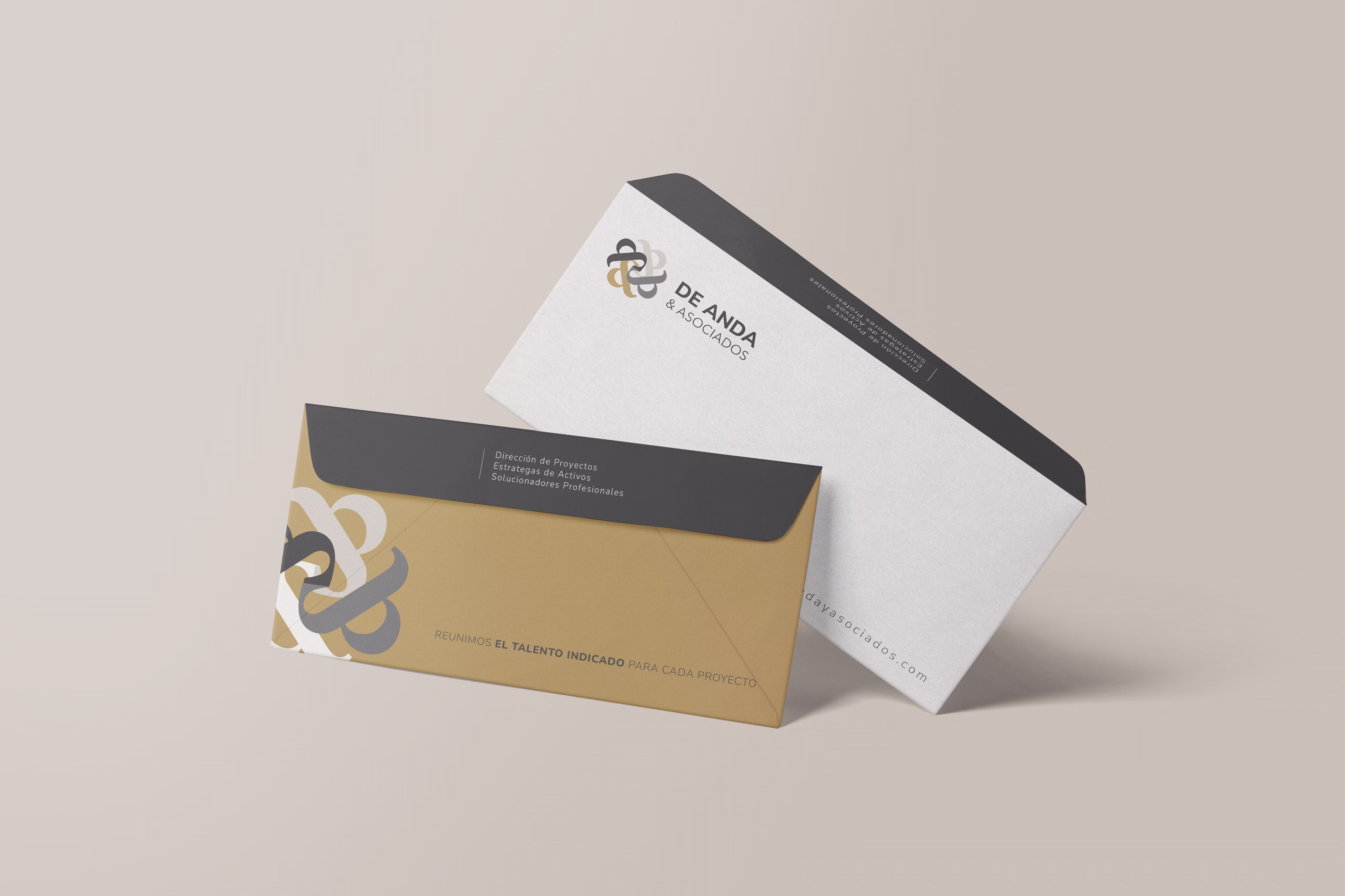
Stationery Applications

Overview
De Anda y Asociados is a hospitality project production firm focused on orchestrating complex developments with clarity, precision, and trusted expertise. The goal was to create a brand identity that reflects their role as the coordinating force behind high-end hospitality projects—bringing together talent, structure, and execution.
The process began with moodboard exploration to define the visual narrative of the brand. Inspired by architecture, structure, natural materials, and rhythmic patterns, the direction communicates order, balance, and controlled complexity—qualities that mirror the way the firm assembles multidisciplinary teams and manages risk throughout a project's lifecycle.
From this foundation, we developed the visual identity system, including typography selection, color palette exploration, and multiple logo concepts designed to convey confidence, structure, and refined professionalism. The final identity includes the primary logo, black and white variants, and a flexible color system that balances architectural neutrals with deeper tones inspired by materials and landscapes.
Initial applications were developed through a set of stationery pieces, demonstrating how the identity extends naturally into everyday business communications while maintaining clarity and sophistication.


Inspired by architecture, material textures, and rhythmic structures, the visual language reflects coordination, precision, and controlled complexity.

Result
The project delivered a cohesive brand identity that positions De Anda y Asociados as a structured and reliable partner in hospitality project production. With a clear visual language, logo system, color palette, and stationery applications, the brand now communicates professionalism, coordination, and excellence across its key touchpoints.